Welcome everyone! We are excited to present our project’s latest advances. We have made great progress since our last update.
A new way of thinking
In our previous devblog, you read that our brainstorming period helped us to define the genre of the game and the foundation of our gameplay.
Since we are now focusing on cooperation rather than competition, we had to rethink the design of the character’s abilities. In our new paradigm, the abilities serve as tools to help the player progress through the levels, rather than as ways to defeat the opponent.
Our first step was to determine the number of abilities players would have at their disposal. If we provided too few, the game might become repetitive and boring. On the other hand, too many might make the game too complex and confusing for less experienced players. We decided on 5 basic abilities for our current prototype:
Gravity Inversion: We particularly liked the “heads and tails” aspect in our previous prototype, so we definitely wanted to keep it. However, unlike in the old version, where each player was confined to their own gravity, the cooperative aspect here involves some control over gravity usage. That’s why we give players the option to choose when they want to change their gravity.
Smash: Smash makes the most sense when thinking about gravity inversion. It offers a great deal of potential for use in various situations. It remains relatively unchanged from before.
Kick: This new ability allows you to expel a tile horizontally, as opposed to Smash, which works vertically. It’s the most efficient way to share a tile with your distant teammate, like across a chasm, for example.
Attract: Oops! Your teammate didn’t aim well, and they sent a tile far away. Don’t panic, Attract is here to help. It allows you to bring a tile in front of you.
TakeOff : This was already super fun in the previous prototype. It will now serve as a kind of ‘super jump’ when you are surrounded by tiles. It will launch your character up into the air so you can reach other parts of the level.
As you can see, we deliberately kept a relatively simple set of abilities. Our intention behind this is twofold. The first is to keep the game easily accessible, with no complicated manipulation required to play. You can have fun with anyone, whether they’re an expert in tile handling or a complete novice. The second is to allow for user creativity when problem-solving, as there are many different ways to use each power.
With the mechanics in place, we still had to define the overall theme of our game, to provide a context for our work. Here is what we came up with:
“Inter-dimensional rifts have opened in the universe, causing instabilities. You play as agents of RFCorp. Your mission is to explore these rifts and deploy devices to close them and restore balance to the universe.”
Pretty exciting, right?! This will serve as our guideline throughout the entire game development process. Whether it’s for environment creation, level design, or gameplay mechanics, we can always check whether an element is consistent with our vision.
Environments and Atmospheres
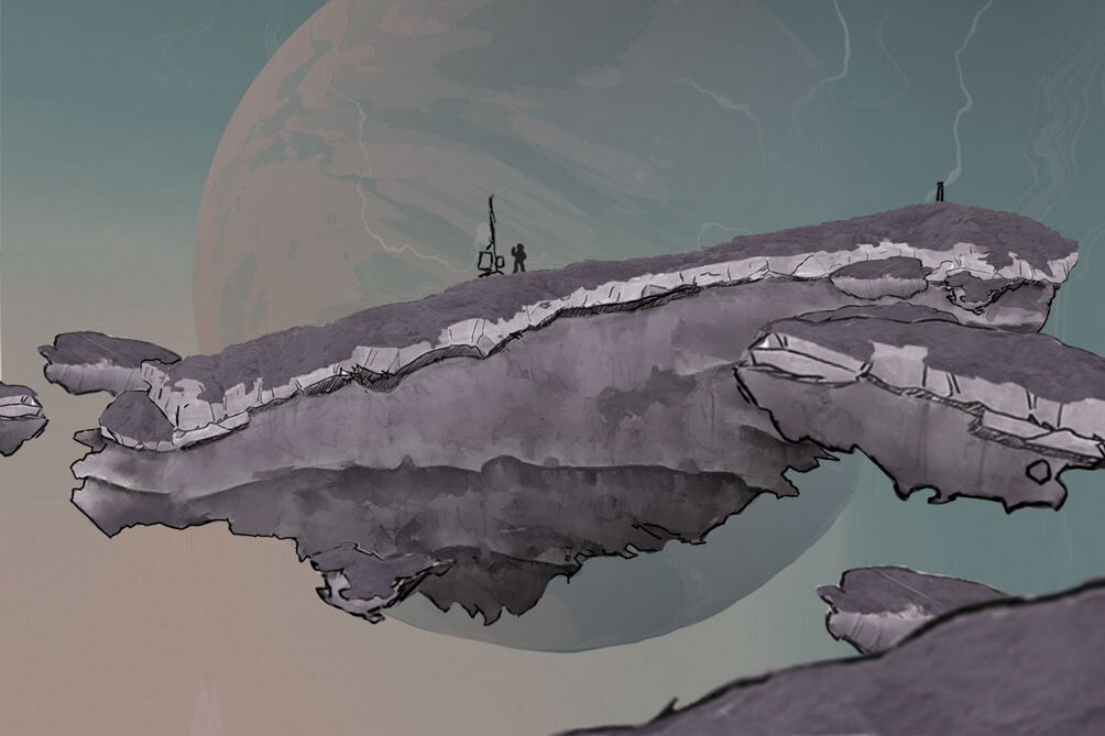
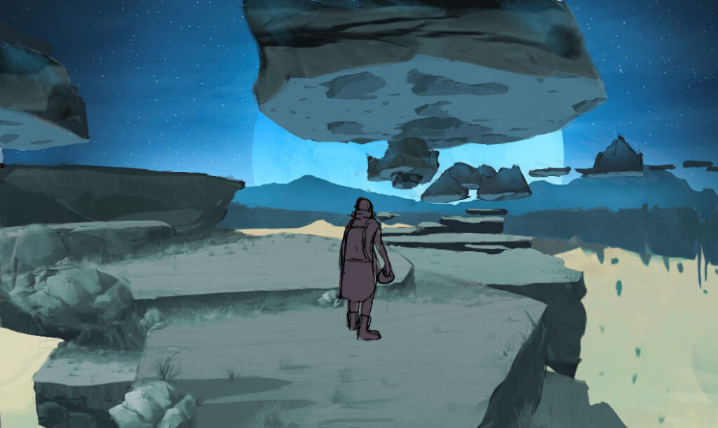
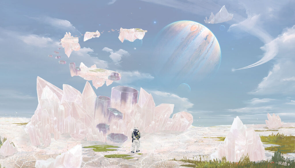
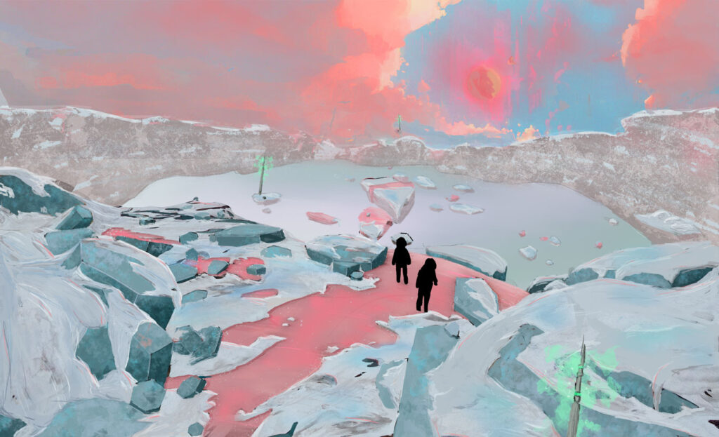
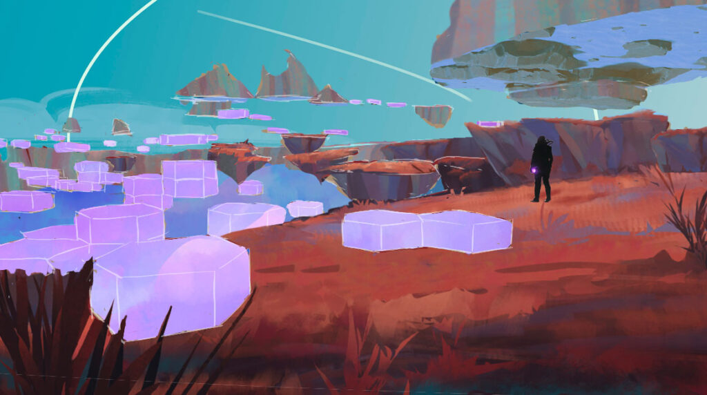
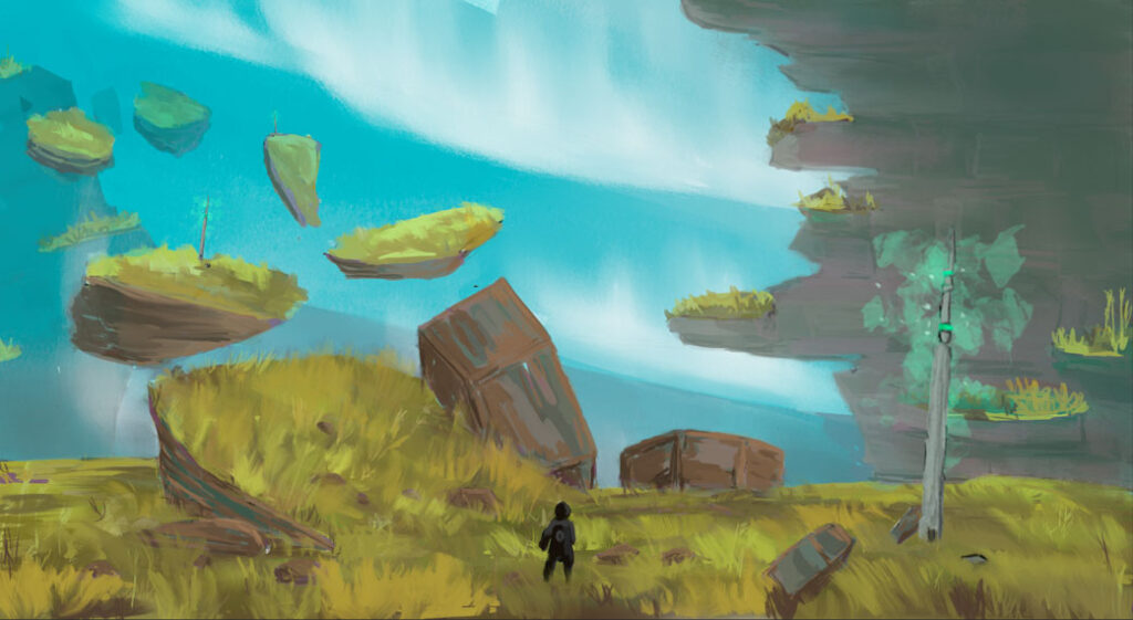
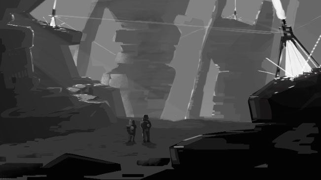
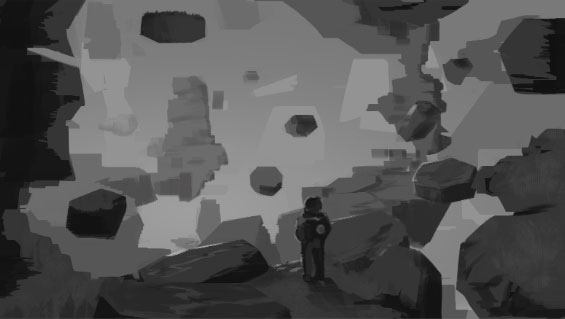
As we mentioned, the concept of rifts convinced us all. The next step was to start environment design process. Our first goal was to find and define immersive atmospheres that could serve our story and enhance our gameplay. We had some initial questions: What should our worlds look like? What materials, colors, and topography should we use? Even more importantly, how could we make the ambience of two different worlds coexist within the same rift? We needed to make everything coherent and understandable for the player without sacrificing our artistic desires.
We carried out an initial round of research and sketches. After aligning our vision, each team member was able to input what they thought the defining characteristic of each world should be. During an afternoon of brainstorming, we confronted our ideas and quickly noticed that several types of atmospheres were shared among us. Agreeing so easily on certain moods seemed like a good sign, and it encouraged us to develop them more in-depth over the following weeks.
First Drafts of Level Designs
We found the concept of crossing rifts quite interesting. But was it a good idea? It was time to create a level to find out.
Beyond some basic gameplay mechanic blockings, we designed a first rift. We were thus able to visualize the size necessary for our levels to provide the desired feeling. If they were too large, it would seem impossible to cross the rifts and give a sense of emptiness. If we made them too small, it would generate a feeling of suffocation – not very pleasant in a platforming game. Visually, we wanted to feel like we were progressing within an environment whose edges had been fractured by force during its creation. With all of this in mind, here’s our very first test level:
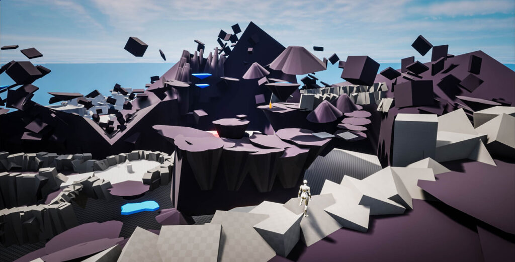
We weren’t disappointed; the feeling during our test session was very encouraging. We were certain that our idea had potential and that we could continue down this path.
At the same time, we took advantage of this new environment to test various mechanics under real conditions. This testing was very informative, as it allowed us to make an initial round of adjustments. For example, the height at which the character is propelled when using their TakeOff ability felt strange, and we were able to quickly adapt it. The gameplay experience was immediately improved.
Character Design
Now we were ready to tackle our first character design. The default Unreal Engine character is cool, but it didn’t fit with our artistic direction and was influencing our perception of the game too much.
We followed a multi-phase process: First, we needed to determine the general direction we wanted to go in. We started with a shape study that led to a character with a cartoonish, child-like figure. When exploring the different rifts, the character will have to go through hostile environments and will need adequate protection. We were inspired by real and fictional space suits and helmets. We also incorporated hexagons in the design; this made the character feel more grounded in our world.
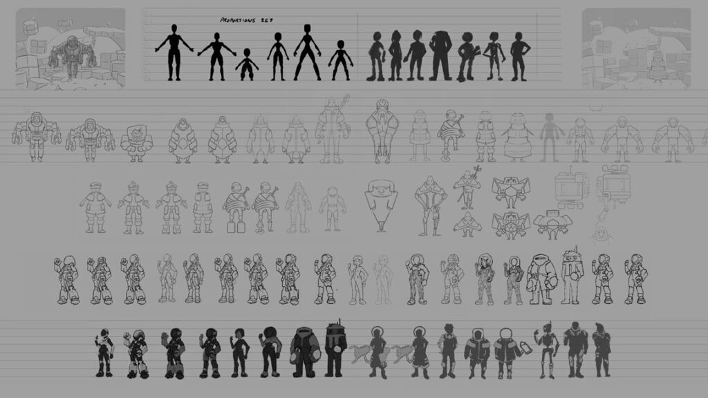
So many choices! After selecting the proportions, we were ready to draw the first iteration.
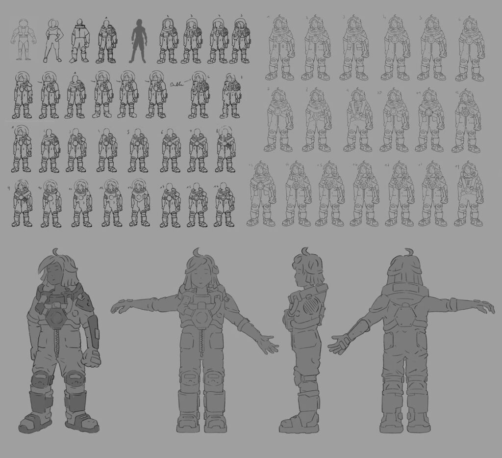
After a lot of behind-the-scenes work… TADAAA! Here is what our character looks like.
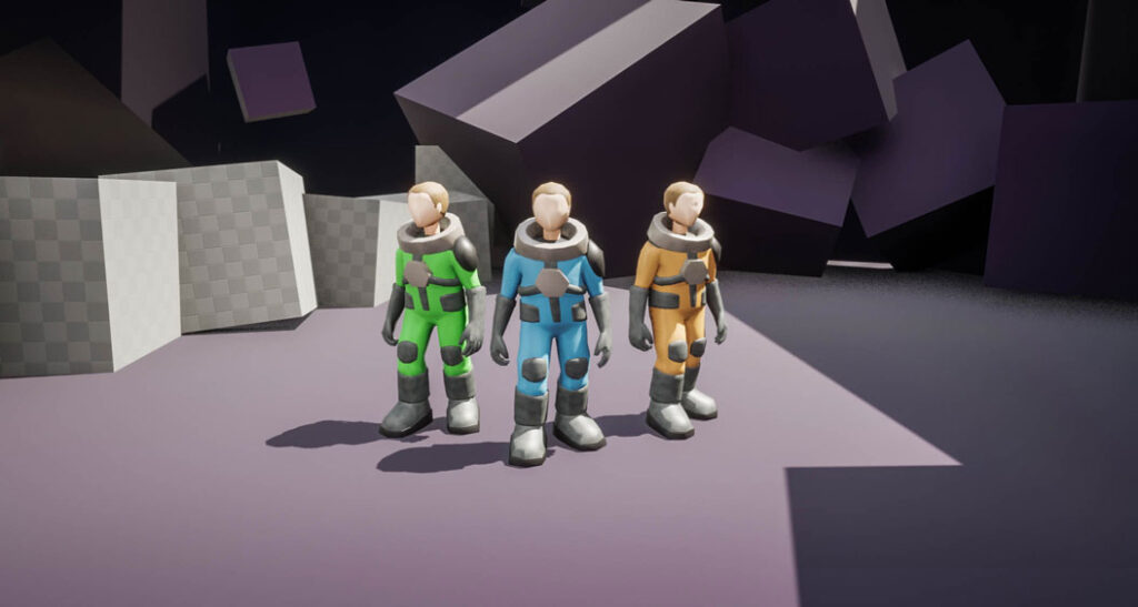
We know what you’re going to say : “Hey, they don’t look at all like the drawing!”
You have a sharp eye. Our character model is not very accurate. That’s because the complete modeling of a character takes a lot of time. Our goal with this first model wasn’t to have a final render that stuck to our character sheet, but rather to have a basis that would let us test proportions. It was important for us to visualize the character in space and to compare it with the various elements that make up our levels.
Next, once we’re satisfied, we will be able to tackle the modeling work to create an impressive character. That will be in a later episode… So, stay tuned!
The character design process allowed us to challenge ourselves on a part of the production that we had never worked on before as a team. This has been a journey, but now it’s fun to see our own character evolve within our levels. This brings us a real sense of progress and makes our game feel less like a basic prototype.
What’s next?
We’ve made so much progress. We have our own character, and the worlds we imagined are starting to take shape. We are thrilled with our achievements and with the direction our game is taking.
All this work has allowed us to identify the most important points to focus on in order to develop and improve our game. Refining the character’s behavior will be essential, as it will greatly influence how we design both our universe and our levels. This is what we are working on as you read these lines.
Thank you for following us on this adventure and for supporting us with your feedback and encouragement. Stay tuned for our next devblog, where we will continue to share the evolution of our project.
See you next time!
N.B. All images are for illustration purposes only. They do not reflect the game’s final visuals or gameplay.
